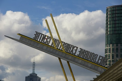
These two shots weren't really planned. They were shot a couple of weeks ago when I was walking towards Southbank in the afternoon. I was squinting up at the bright sunshine, to see which way the cloudbanks were moving.
As I did so, I noticed that I was on the "wrong" side of this giant sign above the Melbourne Exhibition Centre, so of course I had to take a shot because the quirkiness of the lettering appealed to me.
And in case you're wondering, this is what the sign looks like if you're on the "right" side looking up at it.

For other participants in Dot’s concept, go to Sky Watch HQ.

26 comments:
Kinda lije going to the chiropractor for my achy neck .. I may have to stop back a few times a week .. I have insurance, do you take a co-pay?
You and that camera...I'm beginning to think that it may actually be grafted to your neck. Glad you thought to give us the "right" side...else I'd have been hauling my floor length mirror in here to figure her out!
Sandi
Is it an exhibition of chopsticks?
RMxx
Now you have really made an exhibition of yourself! ;-)
like the look of the sign. very modern...clean lines...eye catching
Hey I'm all for a little exhibitionism. In the first angle it looks as though they're preparing to launch the marquee into orbit. Very curious!
This would've made a good "Odd Shot" too. If you participate in "Odd Shots" that is.
Likewise Sandi... was craning my neck to see what it said.
Golly, word veri is ringnob. How rude these things can be!!
That was very good! I'm glad that you put in a photo the correct way round as I might have started standing on my head with disastrous results!
Come to think of it, does look like chopsticks, just like Rebel Mother said!
That looks really cool.
i'm ready to take off.
Interesting sign. I too was ready to get a mirror out to read it.
Great shots!
Just dropping in for a quick visit on my day at home. Missing you David!
What a fun shot! I'm with Daryl, like going to the chiropractor! Let us know about the co-pay! And thanks for right side one, too!
Have a great weekend, David!
Sylvia
Something about it reminds me of a retro type diner?? Am I crazy? LOL! Great photos!
What a clever sign. Happy SWF :)
I like the backwards letters, but the front-ways lighting.
That's a good skywatch.
Sydney - City and Suburbs
good one David..always an interesting one when I come here.
nice capture...love the font they used on the sign...so clean and neat. looks fab against the sky.
have a great weekend.
Interesting that the powers that be chose to point the sign the "right" way, and the heck with those looking from anywhere else!
Great spot David!
What a perfectly odd sign, but it is certainly going to get a lot of attention. I guess that is what a sign is for, though!
Now that is really interesting photography. You have us all twisting our necks to read the 'Sign along the dotted (beautiful blue sky)line'. And then sighing in releif as we see the second picture. Ha ha. Love all the reactions you got from every one.
On a second thought, would'nt they be better off having a similar sign on the other side of the structure so people from that side can also read it right ?
Those beautiful clouds form a great backdrop for the first picture David.
Love all the angles and clean lines.
The sign draws me in and makes me want to attend the exhibition. Great way to photogragh it.
Post a Comment